Working with dyes is an imprecise calculation. I know approximately how much dye for about that much water & chemicals & fabric. Measuring exactly is not really how I work. I love browsing the pages of dyes. The colors are brilliant. No matter where you look, the warnings sound the same:
Please Note: These colors are a representation of the actual dye.
Colors may vary due to your computer settings.
Please test colors before beginning a project requiring an exact color match.
Here is #603, Nickel, as it appears on my computer screen:
 Here is the color I think of when I think of a nickel:
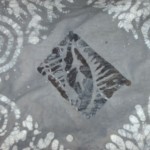
When ordering, I remained optimistic that the color would present close to the color of our monetary nickel. Here is a piece I dyed nickel recently (in the middle is a new wax stamp, on the corners, the first wax stamping when the piece was white)
 Now I will admit that on my computer screen, these colors don’t look so off. But let me tell you how shocked I was when I first saw a piece of fabric I dyed nickel. It’s a dark gray. I like gray, and dark gray has it’s place, but not so much in my world of fabrics and colors.
I put a lot of stock in the name of a color. Nickel to me is a mellow gray, a light color, kinda like the color of a nickel. Possible better names for the color currently known as nickel might be: ominous sky, dark gray, dark nickel, dirty nickel, foggy bottom, somber stone or dark slate. I’m just saying.
